
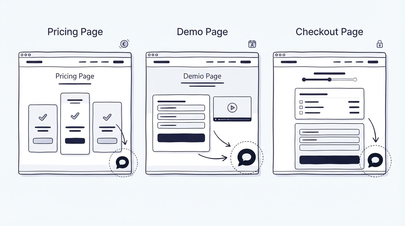
A visitor reaches your pricing page, pauses on an annual plan, then leaves without asking why a feature is missing. Another visitor starts a checkout and needs a quick answer about invoices or security. A single chat setup treats both moments alike and leaves valuable context unused.
A website live chat widget should follow page intent. Cajobo helps teams combine live conversations, self-service answers, and feedback signals, so the right response can match the visitor's stage rather than interrupt it.
Quick answer: where to place a website live chat widget
Set up your widget around the job each page visitor is trying to complete:
- Place a quiet, persistent launcher in the lower corner on pricing, demo, and checkout pages, clear of key buttons and mobile controls.
- Show a pricing prompt after meaningful engagement, such as plan comparison or time spent reviewing annual billing.
- Use the demo page to qualify the question, offer scheduling help, and route technical evaluation questions to a prepared owner.
- Keep checkout prompts minimal and transactional, focused on payment, billing, security, or account-access blockers.
- Set staffing rules by page priority, business hours, expected first-response time, and a clear fallback for offline visitors.
- Review chat transcripts by URL every month, then turn recurring unanswered questions into help articles, page copy, or feedback items.
Start with page intent before choosing widget placement
A lower-right launcher is familiar, but familiarity alone does not make it effective. Its exact position, prompt timing, and conversation opening should support the visitor's immediate task.
Use the same anchored launcher location across the site. Visitors learn where to find it. Then vary the message and routing by page. Keep the button above cookie banners, discount bars, accessibility controls, and mobile browser controls. Test it on the smallest viewport your analytics show regularly.
Accessibility needs a place in this decision. Keyboard users should reach the launcher in a logical sequence and see a clear focus indicator. The W3C guidance on focus order explains why focus should preserve meaning and operability. Give the launcher an accessible name such as “Chat with sales” or “Get checkout help,” rather than relying on a speech bubble icon alone.
A practical way to plan the setup is to map three fields for every high-intent URL: visitor goal, likely blocker, and response owner. The table below shows how those fields change across common conversion pages.
| Page and visitor goal | Recommended widget behavior | Proactive prompt trigger | Staffing and fallback rule |
|---|---|---|---|
| /pricing - compare plans and validate fit | Persistent launcher with sales-focused opening | After a plan switch, billing toggle, or 45 to 90 seconds of engagement | Sales or product expert during coverage hours; collect email and question outside coverage |
| /demo - decide whether to book time | Launcher that offers scheduling or evaluation help | After form hesitation or repeated visits | Sales development owner handles fit questions; technical questions enter a tagged queue |
| /checkout - finish a purchase | Small, low-distraction launcher with transaction help | After a payment error, prolonged idle time, or return from a billing step | Highest-priority coverage; send billing issues to an owner with payment access |
| /security or /integrations - assess risk and requirements | Launcher with technical topic choices | After reading multiple technical sections | Route to a subject-matter owner; provide a response-time expectation |
Where to place a website live chat widget on a pricing page
Pricing pages attract visitors who have moved beyond general interest. They may be checking plan limits, comparing monthly and annual billing, confirming a capability, or seeking procurement information. The chat experience should help them complete that evaluation quickly.
Place the launcher in the lower-right corner when the page has a left-aligned navigation menu or a floating comparison control. Move it to the lower-left only when right-side UI elements create a collision. Keep a generous gap from sticky buttons, especially on mobile.
The prompt deserves more restraint than the launcher. Trigger it after evidence of evaluation: a visitor opens a feature comparison, changes billing frequency, scrolls between plan cards, or spends enough time reading the detail. A useful opening is specific: “Questions about plans, billing, or feature access?” It tells the visitor what support is available without making a broad demand for attention.
Avoid opening chat the moment the page loads. Visitors need time to orient themselves, and instant overlays obscure pricing details at the exact point they are trying to read them.
Worked example: a SaaS pricing page with three plan cards
Consider a hypothetical project-management SaaS with /pricing, /demo, and /checkout pages. Its pricing page has Starter, Team, and Scale plan cards, a monthly or annual toggle, and a feature table below the fold.
The team initially launches a prompt after 10 seconds: “Need help?” The prompt appears while visitors are reading the first plan card. Conversations are sparse, and the few chats begin with “Please close this.”
The team changes the setup. The launcher stays visible from page load. A prompt appears only after a visitor toggles annual billing or reaches the feature table. It asks, “Want help comparing Team and Scale?” This wording fits the moment. The chat owner receives the current URL and can ask which team size or workflow the visitor is evaluating.
Export the last 90 days of pricing-page chats first. Group questions into plan limits, billing, security, migration, and missing features. Update page copy for the first three groups with recurring volume. Send missing-feature requests to the product feedback workflow.
For more on choosing the underlying tool and expected capabilities, see how to choose a live chat widget for a small business website.
How to use a website live chat widget on a demo page
Demo pages serve two visitor groups. One group is ready to schedule. The other still needs enough confidence to submit the form. Chat should remove an immediate obstacle while preserving the main conversion path.
Keep the launcher visible, but avoid covering the form's submit button, privacy notice, or calendar embed. If the form is short, place the widget on the opposite side of the screen from the primary action. Test the page at mobile widths, where chat buttons often overlap form fields and consent checkboxes.
A demo-page prompt can appear after form hesitation. Useful signals include starting a field and leaving it empty, returning to the page within a few days, or spending time on a technical section below the form. The conversation can start with a choice: “Need help with fit, technical requirements, or booking a demo?” Choices reduce vague openings and give the agent context before the first reply.
In the example SaaS, the demo page receives questions about SSO, data residency, and implementation time. The sales owner can answer fit and scheduling questions. A technical owner needs a defined handoff path for the other topics. Set that path before publishing the prompt. A slow or uncertain reply at this stage can create more friction than a visible widget.
Route each conversation with its page URL, selected topic, and account details when available. Cajobo Live Chat provides a place to manage these conversations, while a documented knowledge base gives agents a consistent source for common answers. See how to structure a SaaS knowledge base for the articles worth preparing before traffic grows.
How to use a website live chat widget during checkout
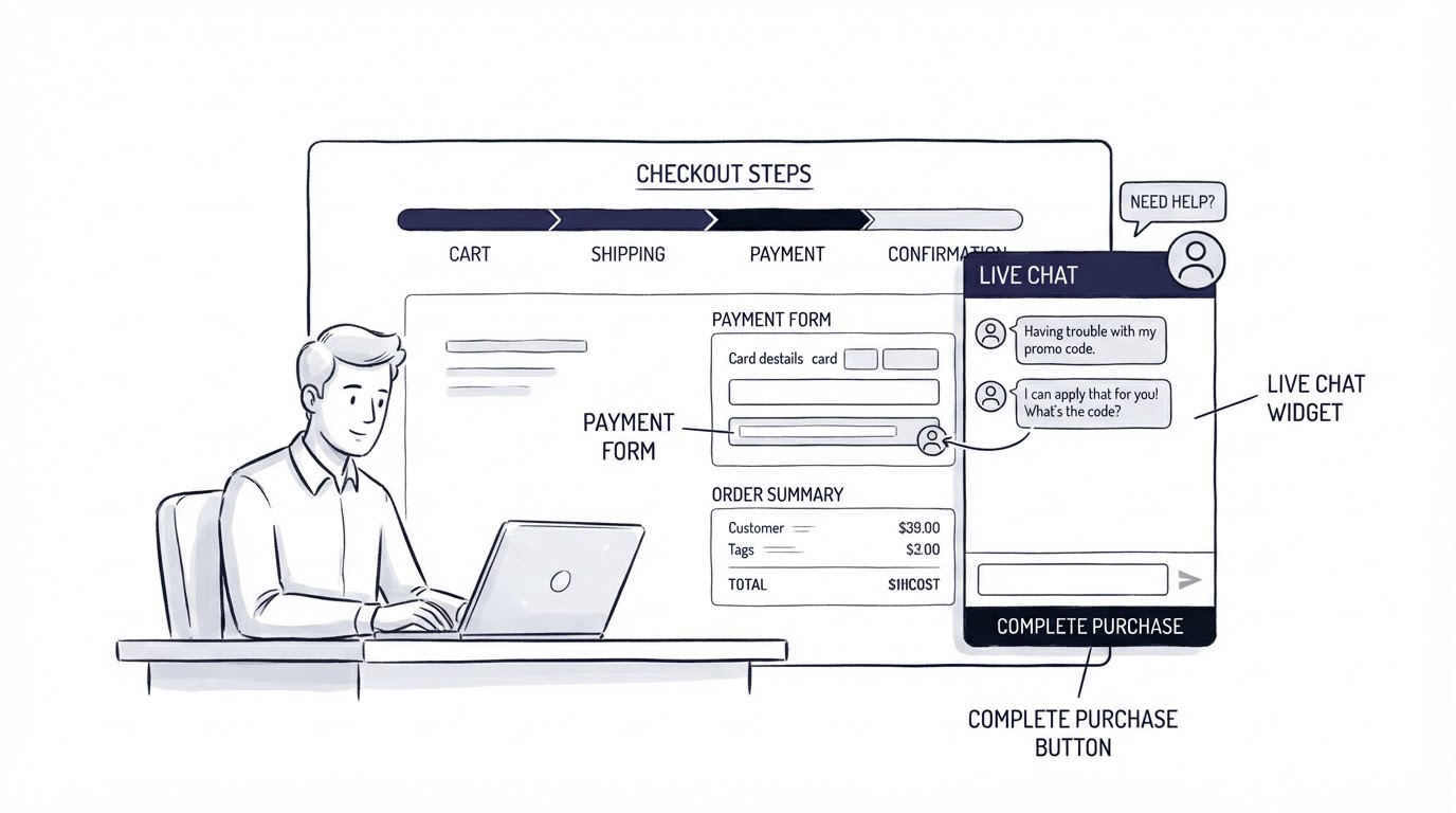
Checkout visitors have a narrow objective: complete a transaction. A large invitation, long qualification flow, or sales-oriented pop-up can pull attention away from the payment sequence.
Use the smallest appropriate launcher on checkout. Write the opening around transactional blockers: “Need help with payment, billing, or your account?” Keep chat available, yet passive until a clear friction signal appears.
For the hypothetical SaaS, a visitor reaches /checkout/team-annual, selects the Team plan, and pauses at the billing-details step. The original prompt says, “Book a demo with our team.” It has the wrong purpose and sends a ready buyer backward in the journey.
Replace it with checkout help. Trigger after a payment error or a sustained idle period. Route messages about invoices, card issues, receipts, and tax details to the person who can resolve them. Give agents a secure process for account verification. Keep sensitive payment data out of chat transcripts.
Set an explicit offline message as well: “Leave your email and invoice question. We reply by the next business day.” A clear expectation reduces uncertainty. Checkout deserves the shortest first-response target of the three page types, because a delay can end the buying session.
Set live chat staffing rules by page priority
Widget placement only works when someone can respond with the right level of authority. Coverage does not require a large team, but it does require honest rules.
Define coverage hours on the widget and decide who owns each question category before launching proactive prompts. A small team may cover pricing and demo questions during business hours, then collect messages overnight. Checkout issues may need an on-call owner during active selling periods or a highly visible support route for urgent payment failures.
Give agents short response guides for frequent questions. For example, a pricing agent needs current plan definitions and billing rules. A demo agent needs qualification questions and a technical escalation route. A checkout agent needs access to payment-status information and a safe verification process.
The shared inbox becomes important once more than one person answers. It prevents duplicate replies and makes handoffs visible. This guide to using a customer support inbox for live chat and email explains the operational setup in more detail. For lean teams, live chat hours, staffing, and response standards offers a practical framework for setting expectations.
Use Cajobo to connect chat placement with answers and feedback
A page-intent workflow creates three kinds of information: the visitor's page context, the answer that solved the issue, and the patterns that deserve product or content changes. Cajobo brings those activities together.
Start by adding the Cajobo live chat widget and configuring its conversation entry point for each high-intent URL. On /pricing, use an opening built around plan comparison. On /demo, offer fit, technical, and scheduling routes. On /checkout, focus the entry on billing and payment support.
Next, prepare self-service articles in Cajobo Knowledge Base for questions that have stable answers, such as plan access, invoice availability, implementation steps, or security documentation. Agents can point visitors to a maintained answer while staying in the conversation for follow-up.
Then review conversations that end without a satisfactory answer or reveal a product request. Add those themes through Cajobo Feedback, where the team can collect and prioritize requests instead of leaving them buried in chat history. This is especially useful when several pricing conversations reveal the same missing capability or unclear plan boundary.
The benefit comes from the loop. Pricing-page questions improve pricing copy. Demo objections improve enablement material. Checkout blockers improve the purchase flow. The support team gains a clearer view of the work that affects conversion.
Common website live chat widget placement mistakes
The most frequent mistake is treating every page as a sales page. A checkout visitor needs completion support. A returning customer on a help article may need troubleshooting. A pricing visitor may need a plan comparison. Match the prompt to the task in front of them.
Another issue is placing the launcher over important interface controls. Check mobile screenshots and real-device sessions before release. The W3C target-size guidance is useful when reviewing closely packed touch controls.
Teams also create a gap between proactive chat and staffing. A message that promises immediate help requires a person who can provide it. Use a time-bound promise that reflects actual coverage, then measure first response by page type.
Finally, avoid treating transcripts as a closed support record. Read the conversations from /pricing, /demo, and /checkout separately. Each URL exposes a different form of friction.
FAQ
Should a live chat widget appear on every page?
A persistent launcher can appear across the site when it stays out of the way and meets accessibility requirements. Proactive prompts should be limited to pages and behaviors where a timely conversation can help. Pricing, demo, checkout, security, and integration pages usually deserve the most careful setup.
What is the best live chat prompt for a pricing page?
Use a prompt tied to evaluation work, such as “Want help comparing plans?” or “Questions about billing or feature access?” Trigger it after the visitor engages with plan details. Generic greetings provide little context and often arrive too early.
Should chat pop up during checkout?
Use a passive launcher by default, then trigger a focused prompt after a payment error or meaningful inactivity. Keep the language limited to payment, billing, and account-access help. The checkout flow should remain visually calm.
How quickly should a team answer live chat messages?
Set a target based on page value and staffing capacity. Checkout messages deserve the fastest response because the visitor is actively trying to pay. Pricing and demo questions can use business-hour coverage with a clear fallback message. Publish only response expectations your team can meet consistently.
How can chat conversations improve a website?
Tag conversations by page URL and question type. Use recurring questions to improve copy and knowledge base articles. Send repeated feature requests into a feedback process. This turns live chat into a source of conversion and product insight, rather than a separate support channel.
Set up the launcher first, then configure one intent-specific prompt for /pricing, /demo, and /checkout. Review the resulting conversations after a month and adjust the wording, routing, and page content around the actual questions visitors ask.