
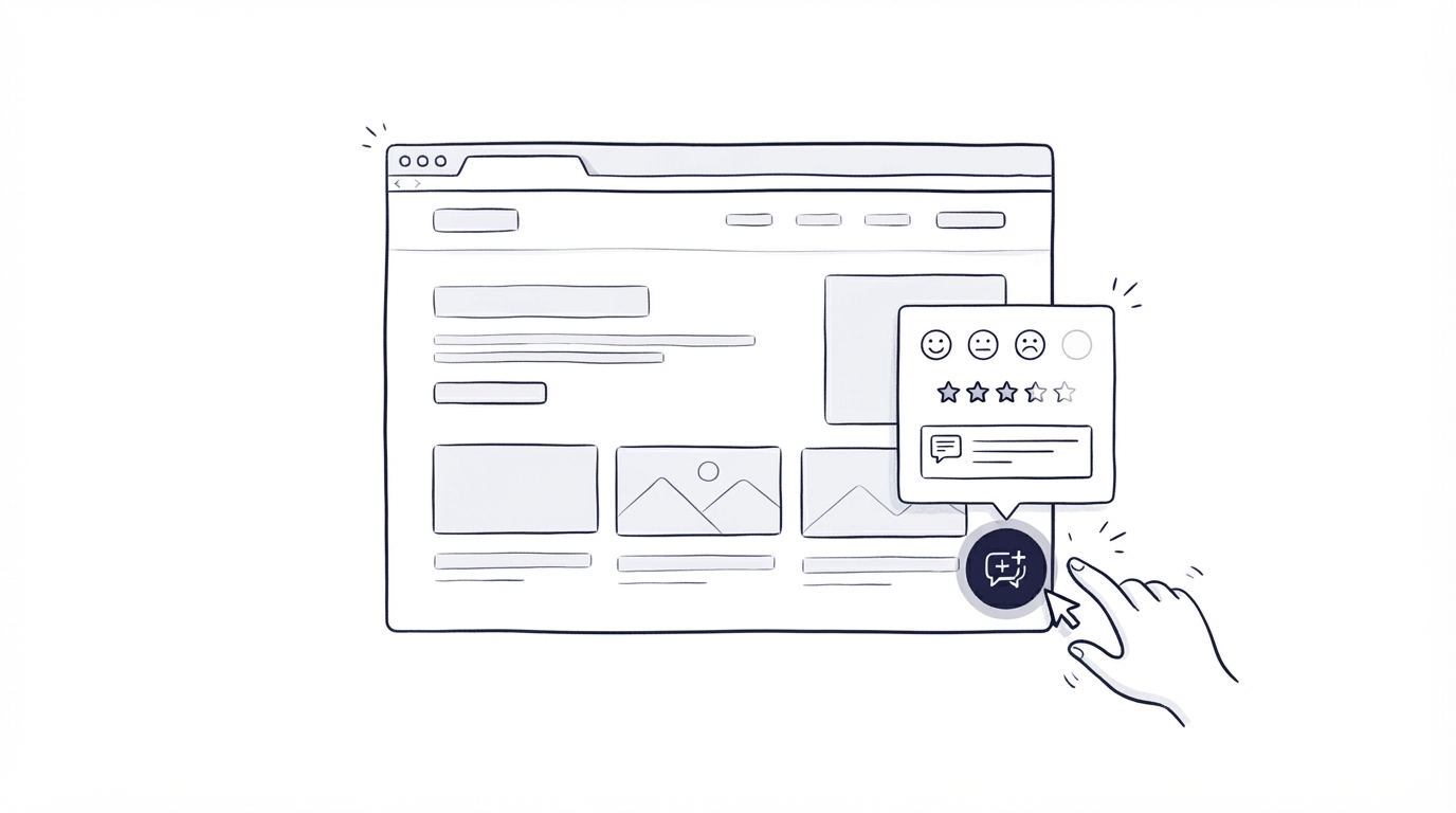
A feedback prompt that appears while someone is entering card details, comparing plans, or trying to solve an urgent problem can create frustration and hide the signal you need. Placement and timing determine whether a website feedback widget feels like a helpful invitation or an interruption.
Cajobo helps teams connect feedback with the conversations, help content, and product decisions that follow. Start with one meaningful customer moment, then make the request brief and easy to dismiss.
Quick answer: where to place a website feedback widget
Use this workflow to add a website feedback widget without getting in the way:
- Map the page to one customer goal, such as evaluating pricing, completing setup, or finding an answer.
- Place the widget after progress, at a natural pause, or on a low-risk page edge.
- Trigger it after engagement, such as a scroll threshold, time on page, or completed support interaction.
- Ask one rating question first, then offer an optional short follow-up field.
- Keep the widget outside checkout, sign-up fields, authentication, and other high-concentration tasks.
- Review responses by page and theme, then route recurring requests into support fixes or product planning.
Choose website feedback widget placement based on page intent
Every page has a job. Your widget should support that job by appearing when a visitor has enough context to form an opinion.
A pricing page can reveal which plan details feel unclear. A documentation article can expose missing instructions. An account settings page can identify friction in a completed workflow. Each setting produces a different kind of feedback, so use a different question and trigger for each.
Here is a practical placement guide for common pages.
| Page or moment | Best widget placement | Best time to show it | Question to ask | Keep it away from |
|---|---|---|---|---|
| Pricing page | Bottom-right edge or below plan comparison | After visitors scroll through plans | “Did you find the plan information you needed?” | Plan selector and primary CTA |
| Knowledge base article | End of article | After the article is in view | “Did this answer your question?” | Article title and search field |
| Product dashboard | Side edge of a completed workflow | After save, export, or task completion | “How was this workflow?” | Inputs, menus, and confirmation messages |
| Feature page | Below key benefits or near page footer | After meaningful scrolling | “What would you need before trying this?” | Demo and trial forms |
| Support conversation | Conversation close or follow-up page | Once the issue is resolved | “How helpful was this support?” | Active chat composer |
Consider a fictional B2B invoicing product, LedgerFlow. Its team wants feedback on /pricing, /help/importing-clients, and the completed import screen inside the app.
On /pricing, a compact tab sits at the lower-right edge after a visitor reaches the plan comparison. The prompt asks whether the visitor found the required plan details. On the help article, a one-tap response appears below the final step. Inside the app, the team waits until an import succeeds and asks about the import experience. These placements give each response clear context: purchase evaluation, self-service support, or product workflow.
Avoid attaching the same generic question to every page. “How would you rate our website?” gives the team very little to act on.
For more page-level ideas, see our guide to customer feedback widgets on a website.
Set website feedback widget triggers that respect attention
A visible widget can be available throughout a session. A prompt that opens automatically needs a much higher bar because it takes attention away from the current task.
Use engagement signals that show the visitor has experienced enough of the page to comment. On LedgerFlow's pricing page, the team uses a scroll threshold after the plan comparison comes into view. A visitor who reaches that point can comment on the details, while someone who leaves after the headline has less context.
On an article, trigger feedback when the reader reaches the final section or spends enough time reading. On a completed workflow, trigger after the confirmation state appears. For a support interaction, collect a response after the conversation has been marked resolved.
Keep frequency low. Show a prompt once per visitor for a specific context over a reasonable period, then give the person a clear close control. A small persistent launcher often works well for broad, ongoing feedback because visitors choose when to open it.
Interaction controls also need to work for keyboard and assistive-technology users. Follow the focus, contrast, label, and target-size guidance in the W3C Web Content Accessibility Guidelines when implementing or customizing the widget.
Pages where prompts create unnecessary friction
Some pages demand uninterrupted focus. Keep automatic feedback prompts off payment forms, sign-up forms, password reset flows, authentication screens, error recovery screens, and full-screen onboarding steps.
LedgerFlow originally planned to show the pricing question after 20 seconds on every visit. That approach would have caught people while they compared options or started a trial. The team moved the trigger to the plan-table scroll event and changed the prompt to a small tab. The page still collects feedback, while the main evaluation path remains clear.
Ask questions that create usable feedback
A useful feedback widget has one immediate question tied to the page or task. Keep the first interaction lightweight: a helpful/unhelpful choice, a short satisfaction scale, or a concise sentiment question.
Then ask an optional follow-up that explains the rating. For example, after a visitor selects “No” below an import help article, ask: “Which step needs more explanation?” This wording gives the customer a clear response frame and gives the content team an identifiable repair task.
Use open text after the rating rather than before it. The rating creates a simple response path for people in a hurry. Written context adds detail for people willing to share it.
On LedgerFlow's pricing page, “Did you find the plan information you needed?” produces clearer decisions than “Any feedback?” A response that says “I cannot tell whether client imports are included” points directly to a pricing-page edit. The team can add that detail, then monitor later feedback on the same page.
One-tap feedback works especially well at the end of help content and resolved support conversations. Our article on measuring customer satisfaction with one-tap feedback explains how to structure that response loop.
Design the widget so it stays out of the way
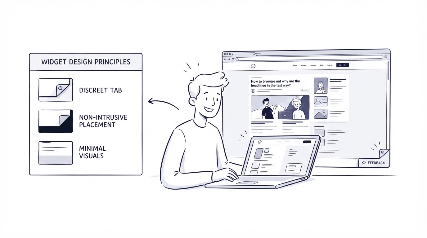
Position a persistent launcher where it avoids key navigation, cookie controls, chat controls, and mobile browser controls. Bottom-right placement is familiar, though it can conflict with live chat. When chat already occupies that corner, use a nearby edge position or let a single launcher offer a clear choice between getting help and sharing feedback.
Give the widget an accessible name that describes its purpose, such as “Share feedback about this page.” Use enough contrast for the control and preserve visible keyboard focus. A clear close button and a short first screen help people retain control of the interaction.
Mobile deserves separate testing. A widget that is comfortably placed on a large desktop display can cover a primary button on a phone. Test at common viewport sizes, including a keyboard-open mobile view when visitors may type a comment.
Use real session recordings, page analytics, and support messages to identify conflicts. For custom implementations, Google Analytics event documentation explains how to record interaction events such as widget opens, ratings, submissions, and dismissals. Compare those events with the page's main conversion or completion event before expanding the placement.
Use Cajobo to move website feedback into action
A standalone prompt can collect comments, yet the operational work starts after the submission. Cajobo is useful when feedback needs a home alongside support and product planning.
Start in Cajobo Feedback by creating a feedback destination for the theme you want to understand, such as pricing clarity, onboarding, or import workflows. Add the website feedback widget to the pages where that theme appears. Keep the prompt wording tied to the page goal.
When a LedgerFlow visitor submits “I need to know whether imports are included,” the team can review it with the page context and group it with similar comments. Product requests can then feed a shared feedback board, while an unclear help article can be assigned to the support or documentation owner. When the improvement ships, a product update closes the loop with customers who care about that topic.
This workflow keeps feedback from becoming a spreadsheet of isolated comments. It also helps teams separate three different jobs: fixing a support gap, clarifying a marketing page, and prioritizing a product request. Learn how to make those prioritization decisions in our guide to a public product roadmap and customer feedback.
If the same visitor needs immediate help, direct them to a support route rather than forcing them through a feedback form. A live chat setup can handle time-sensitive questions, while feedback captures patterns that deserve a broader fix.
Review feedback by page, question, and customer intent
Export or review the last 90 days first. Tag responses by the originating page, sentiment, topic, and customer stage where available. This makes a response from /pricing meaningfully different from the same response on a post-purchase settings screen.
Look for clusters before acting. Three comments about unclear import limits on the pricing page suggest a content issue. Several low ratings after the same import error suggest a product or support issue. A single detailed request may still be valuable, especially when it comes from a customer segment your team serves closely, though it needs context before it drives the roadmap.
Set an owner and a review cadence. A weekly review suits high-traffic support content. A monthly review may suit lower-volume feature pages. Record the decision beside each recurring theme: update copy, revise a help article, respond through support, investigate a defect, or consider it for product planning.
Common website feedback widget mistakes
The most common failure is a widget with no defined destination for responses. Teams collect comments, then lack an owner, a review schedule, or a way to tell customers what happened next.
Another failure comes from measuring response volume alone. A high number of submissions can signal an intrusive placement. Track submission rate alongside dismissals, page exits, task completion, and the quality of the comments. A smaller volume of page-specific feedback can be far more useful.
Also avoid using the widget as a substitute for a clear support path. Visitors with urgent account, billing, or access problems need timely help. Keep support channels visible, and use feedback to identify patterns across those conversations. Our guide on using a customer support inbox for live chat and email covers the operational side of that response path.
FAQ
Where should a website feedback widget appear?
Place it after a visitor has experienced a page or completed a task. Effective locations include the end of help articles, after a completed in-app workflow, and near the lower edge of a pricing or feature page after meaningful scrolling. Keep it clear of forms, navigation, checkout, and primary calls to action.
Should a feedback widget open automatically?
Use automatic prompts sparingly. They work best after a task completion or substantial engagement with specific content. A persistent launcher suits broad feedback collection because the visitor controls the timing.
What question should I ask in a feedback widget?
Ask about the immediate experience. “Did this article solve your problem?” works at the end of help content. “Did you find the plan information you needed?” works on a pricing page. Follow a rating with an optional question that asks what needs to improve.
How do I keep feedback requests accessible?
Provide an accessible label, keyboard operation, visible focus, adequate contrast, and a close control. Test the widget with a keyboard and at mobile screen sizes before publishing it widely.
How often should visitors see a feedback prompt?
Limit prompts by page context and session frequency. A visitor who dismissed a pricing-page prompt should have room to continue browsing. Repeated requests reduce trust and can distort the quality of responses.
A website feedback widget earns its space when it appears after a meaningful moment, asks one focused question, and leads to an owned next step. Use Cajobo when your team wants to collect that signal and carry it into support, documentation, and product decisions from one place.