

A visitor reaches your pricing page, documentation article, or trial signup flow with a job to finish. When that job becomes confusing, many people leave without opening chat, filing a ticket, or completing a long survey.
An emoji feedback widget gives visitors a low-effort way to signal how a page felt at the moment they used it. Cajobo helps teams collect and organize that page-level feedback alongside broader product feedback, so recurring friction can reach the people responsible for fixing it.
Quick answer: how to use an emoji feedback widget
Place and analyze one-tap feedback with this workflow:
- Choose three to five high-intent pages where visitors make a decision or complete a task.
- Ask one page-specific question and offer a small, clearly labeled emoji scale.
- Trigger the widget after meaningful page engagement, such as scrolling or time on page.
- Review low-score responses by URL, device, traffic source, and response comment.
- Turn repeated themes into a page change, content task, support fix, or product request.
- Measure sentiment again after publishing the change.
Choose high-intent pages for your emoji feedback widget
Start where visitors are closest to a decision, an activation step, or a support outcome. These pages produce feedback that can lead directly to a specific change.
A practical starting group includes your pricing page, the trial or demo signup flow, a key integration page, and the most-viewed help article. A support team may also place feedback on the final article in a common troubleshooting path, where readers either solve their issue or need further help.
Avoid spreading the widget across every URL on day one. A broad rollout creates a large pool of general reactions and makes ownership harder. Begin with pages that have a clear purpose and an owner who can act on the findings.
For example, consider a fictional project-management SaaS called Northstar. Its team sees healthy traffic to /pricing, yet many visitors fail to move into a trial. They place an emoji feedback widget near the comparison section and ask: “Did this page help you choose a plan?” That question gives the pricing team a direct signal about decision confidence.
Use page behavior to guide selection. A page with high traffic and a weak next-step rate deserves attention. A help article with frequent repeat visits may also indicate an incomplete answer. Pair feedback with analytics and support conversation themes instead of treating a score as a final diagnosis.
If you are deciding where a feedback control belongs without interrupting the page, see how to add a website feedback widget without disrupting the user experience.
Write a question that matches the page's job
An emoji feedback widget works best when the prompt refers to the task the visitor came to complete. “How was your experience?” is broad enough to collect a feeling, yet it leaves the team guessing about the cause.
Match the question to the page objective. On Northstar’s pricing page, “Did this page help you choose a plan?” is useful because a low rating points toward unclear packaging, missing comparison details, confusing limits, or an unanswered buying question.
A help article could ask, “Did this solve your issue?” An integration guide could ask, “Could you complete the setup with this guide?” A trial onboarding page could ask, “Was the next step clear?” Each prompt defines the type of improvement the response should inform.
Provide accessible text labels for every emoji. A face alone can be interpreted differently across devices, cultures, and operating systems. The W3C guidance for non-text content explains why controls need a text alternative that communicates their purpose. Labels such as “Very unclear,” “Somewhat unclear,” “Neutral,” “Clear,” and “Very clear” make the scale usable and easier to analyze.
Keep the scale consistent across pages when you want to compare sentiment. Keep the question specific to each page. That combination preserves a common reporting framework while maintaining useful context.
Place one-tap feedback where visitors can respond naturally
Placement affects both response volume and response quality. Put the control close to the point where a visitor has enough information to form an opinion.
On Northstar’s pricing page, the team positions the question beneath the plan comparison and above the trial call to action. Visitors have seen the core decision information. A widget at the very top would gather reactions before the page has done its job.
On an article, place feedback after the steps, answer, or troubleshooting checklist. On a multi-step flow, ask after completion of a meaningful stage rather than during form entry. Keep the response interaction short: one tap first, with an optional follow-up comment for people who want to explain.
Timing needs the same care. Show the control after a visitor has scrolled past key content, spent enough time reading, or reached a successful state. An immediate pop-up interrupts reading and can distort the result toward annoyance with the prompt itself.
Use the following comparison to decide what each response pattern likely needs from your team.
| Response pattern | Likely underlying issue | Best next investigation | Typical owner |
|---|---|---|---|
| Low scores with comments about missing details | Content gap | Read comments and review page questions from sales or support | Content or product marketing |
| Low scores concentrated on mobile | Layout or interaction problem | Test the page on common viewport sizes and devices | Design or engineering |
| Low scores after a product change | Expectation mismatch or feature regression | Compare feedback dates with release notes and session paths | Product and engineering |
| Neutral scores with few comments | Ambiguous value or weak clarity | Test the page message and examine exit paths | Marketing or UX |
| High scores followed by support contacts | Page answers part of the task | Review the next support question and extend the page | Support and documentation |
Analyze emoji feedback by context, not by average score alone
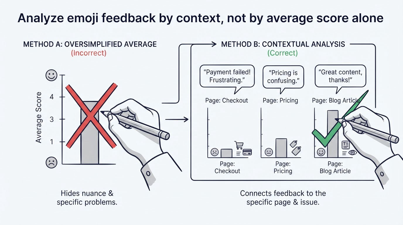
A single average hides the details that lead to action. Ten negative responses from mobile visitors on one browser deserve faster attention than a broadly stable score with no shared complaint.
Export or review the last 30 days first. Group responses by page URL, device type, referral source, date, score, and comment theme. Then read every comment attached to the lower end of the scale. The comments often identify the exact point where a visitor became uncertain.
Northstar receives 42 responses on /pricing during its first month. The overall rating looks moderate. The detail shows a more useful pattern: several low-score comments mention “per-user limits,” and most came from visitors who arrived from the integrations page. The team checks the pricing page and finds that plan limits appear only in a tooltip. They add a visible row to the comparison table, clarify the limit in plain language, and link to a short explanation of how usage is calculated.
That change is specific enough to measure. The team keeps the same question and placement, then compares feedback from the next period. It also watches trial starts from the integrations-page path. Page sentiment can improve while conversion stays flat, which signals that another barrier may remain.
Capture feedback events in your analytics setup when possible. Google explains its event model in its Google Analytics 4 event documentation, which can help your team define a consistent event name and useful parameters such as page path and score. Keep comments out of analytics events unless your privacy process expressly supports that collection.
Turn emoji feedback into fixes that people can own
Every response needs a route to an owner. Without one, feedback becomes a dashboard that people check and forget.
Create a simple weekly review with one person from product, marketing, support, and design. Read low-score comments, group them into themes, and assign a next action. A theme can become a copy edit, a documentation update, a design ticket, a sales enablement question, or a product request.
Use a three-part record for each theme: the page where it appeared, the visitor’s stated obstacle, and the planned response. Northstar’s record might read: “/pricing - integration visitors cannot find user limits - add visible plan-limit row and an explanatory link.” This format removes ambiguity during handoff.
Close the loop where appropriate. If a recurring concern points to a feature request, publish it to a feedback board and let customers follow its status. A public product roadmap gives teams a visible way to connect customer input with product decisions.
How Cajobo supports the emoji feedback workflow
A manual spreadsheet can work for a small test. It becomes difficult to maintain when feedback arrives across website pages, customer conversations, and product requests.
Inside Cajobo Feedback, begin by collecting feedback around the high-intent page or customer moment you want to improve. As responses arrive, keep the page context and response details attached to the feedback record so the team can see what prompted the reaction.
Next, group similar feedback into a shared theme. Northstar could group comments about plan limits, billing clarity, and upgrade rules into a pricing-clarity theme rather than treating each response as an isolated item. This gives product, marketing, and support one place to review the pattern.
Then prioritize the theme with the rest of your customer input. A repeated website complaint may reveal a content issue, while a recurring request across feedback and support conversations may justify a product decision. Teams can use a customer feedback board to prioritize product requests when an issue needs broader validation.
Finally, communicate the outcome. Update the page, publish a product change when relevant, and monitor the same emoji prompt to see whether visitors find the experience clearer. This creates a practical feedback loop from reaction to evidence to improvement.
Common mistakes with emoji feedback widgets
The most common failure is using a generic question everywhere. A vague prompt creates vague work. Write the question around the page’s task.
Another failure is treating every low score as a design problem. A poor reaction can come from pricing, missing documentation, a broken workflow, or an expectation set by an ad. Read the associated comment and referral context before assigning a fix.
Teams also lose useful feedback when the optional comment field feels like a required survey. Keep it optional, use a short invitation such as “Tell us what was unclear,” and let the visitor leave quickly.
Finally, protect visitor trust. Explain how feedback is used in your privacy information, minimize personal data collection, and set clear access rules for response comments. Where support follow-up is useful, offer a separate, voluntary contact option.
FAQ about emoji feedback widgets
Where should I put an emoji feedback widget on a website?
Place it after the visitor has encountered the information needed to complete a page’s main task. Good locations include beneath a pricing comparison, after an onboarding instruction, at the end of a help article, or after a successful form step. Keep it visually present without blocking the next action.
How many emoji options should a feedback widget have?
Five options usually provide enough range for clear sentiment reporting: very negative, negative, neutral, positive, and very positive. Add text labels so people understand the meaning of each response. A three-option scale works when space is tight and you only need a broad signal.
Can emoji feedback identify usability issues?
Yes, especially when you pair each rating with the page URL, device context, timing, and an optional comment. Repeated low scores from visitors using the same device or completing the same task give the UX team a focused investigation point.
Should I ask for a comment after an emoji response?
Offer a comment field after the one-tap response and keep it optional. The rating supplies structured trend data, while comments explain why people reacted that way. This combination is especially useful for pages with high traffic and several plausible friction points.
How often should teams review website feedback?
Review responses weekly while launching a new page, feature, or campaign. Mature pages can move to a monthly review, with alerts or faster checks after a major release. Combine the review with support themes and page analytics so the team can decide what to fix first.
A focused emoji feedback widget gives visitors a fast way to flag uncertainty at the exact moment it occurs. Start with one high-intent page, use a task-specific prompt, assign ownership for themes, and measure the page again after each meaningful change.